I have really enjoyed this course over the past 2 years and have learnt a lot in the process. Hope you enjoy looking through my work.
This blog is now closed.
Final magazine advert
Friday, 6 May 2011
Tuesday, 3 May 2011
Monday, 2 May 2011
Thursday, 28 April 2011
Evaluation - Question 3
What have you learned from your audience feedback?
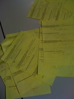
I have used audience feedback right from the start of the year, all the way through to help with different aspects of the course. The first part of audience feedback that I gained was from our friends and family through a questionnaire that we designed as a group. We asked questions such as "How do you usually watch music videos?", "What are your expectations of rock music videos?" and "What colours do you think represent the rock genre? and why?". We handed out paper versions of these questionnaires for people to fill out and also sent them around the social networking site Facebook to gain some feedback from different types of media:
From these questionnaire results we found that most people watch music videos on the Internet and some on the TV but they are rarely downloaded to watch. The majority of people's expectations of rock music videos we found are that they should be mainly performance where the band are shown with their instruments. Also the colours that they associate with the rock genre are mainly dark colours such as black and white and grey. This audience feedback helped us to come up with some initial ideas including a black and white element and some performance shots of a band that we will feature.
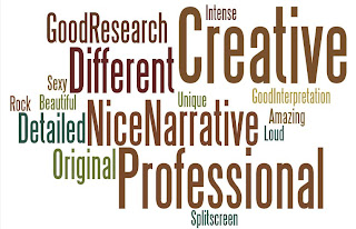
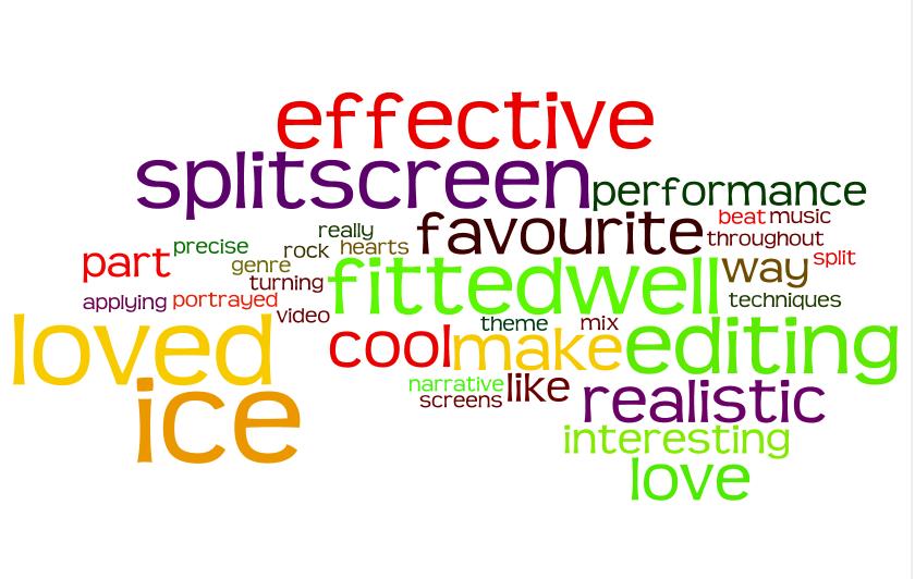
The next part of audience feedback that we received was from people in my media class and my teacher when our group presented a "treatment" to them about what we hoped to achieve with our music video and all of our initial ideas. We got some really positive feedback from everyone that gave us a lot of confidence in our initial ideas and we knew that we had created some ideas that would appeal to a lot of people. This is a world cloud that I created on wordle that included some of the feedback we received:
Some of the other feedback we also gained from this session shaped our video and helped us improve our ideas. For example in the treatment we presented to the class we told them that we wanted to create a performance scene with an audience and have one girl stand out in the clothes that she wears to show she is the obsessed fan. The feedback we received however, told us that if we tried to created to "gig" type of scene it could look really bad as we do not have access to big enough numbers of people to come and star in our "audience" so it would look empty and not very professional. We took this positive criticism from the feedback and decided to instead create a performance scene without an audience and create more of a "band practice" scene.
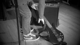
After we had filmed our footage for our video and started to put bits of it together we then gained some more audience feedback to see if we were on the right lines with our production. We showed our friends some of the stop motion clips we made such as the guitar with the kisses and the magazine cuttings building up on the floor. The feedback we got back from this was really positive and everyone seemed to really enjoy it as it was something that was a bit different but really effective when put to the beat of the music. We also showed them the first draft of our music video that was concentrating on the ending where the music builds up and Charlotte rips up all the magazines. Everyone said they loved the first draft especially the stop motions and couldn't wait to see what we did next which gave us confidence to carry on the way we were going.
Each draft that we uploaded to YouTube, we made sure we gained some audience feedback on it to see if there was anything we could improve on or change or add. On draft 3, we gained some feedback from people that said we should take out a clip from the very ending as it looked like we had two endings. After the build up of all the music and Charlotte ripping up the magazines we had a clip of a slow pan across Charlotte's arm resting on top of all of the magazines and then we also had a clip of Tom putting down his bass against an amp. Our feedback told us that by only having one of these clips will make the ending better and clearer to the audience. We then asked a group of people which shot we should take out and the majority of the group agreed we should take out the shot of Charlotte's arm so that the ending shot was of Tom putting down the bass.
Once we had completed almost all of the video, there was just one part that we needed to finish but as a group could not decide that would be effective. It was the very ending of the video just after the stop motion of the sound board. We knew that we needed to have a very powerful ending due to the tempo of the music but we didn't know what to put. We decided to show our video to people in our media class and also people outside of the lesson who had not seen the video before to give us some ideas on how they interpreted the narrative and what they thought would be a powerful ending. We got some really interesting feedback from people on their interpretations of the narrative and they were all quite different which made us realise we had created an enigma code (Barthes) and our narrative could be interpreted in different ways depending on how it was watched and who by. Some of the ideas that we got on how to end our video included:
- Pure performance of Tom on stage
- Charlotte on the stage that the band had been on to represent her presence wherever the band is
- Lyrics appearing on the screen
We decided to take these ideas but also look at other videos on YouTube to see if we could gain any inspiration. We finally decided on our ending of Charlotte having the lyrics painted on her body and smudging them away due to the audience feedback we gained because they helped us see a new perspective on the meaning of our video and helped us with ideas.
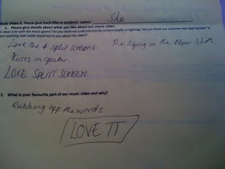
The final bit of audience feedback we gained was from a screening evening at our school where we showed our final video to everyone in our year, the year below and people in year 11 who want to take media studies as an A level. We gave them a sheet of paper with 2 questions on it that were:
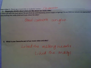
1. What did you like about our music video?
2. What is your favourite part of our music video and why?
All of the feedback we gained from this session was positive which made us really proud to have finished and produced something enjoyable for an audience. These were some of the responses we got from the audience:
All of the audience feedback that I gained throughout the year helped our group to shape the production we made and helped us make some important decisions that improved our video and made it the best quality for our target audience.
I have used audience feedback right from the start of the year, all the way through to help with different aspects of the course. The first part of audience feedback that I gained was from our friends and family through a questionnaire that we designed as a group. We asked questions such as "How do you usually watch music videos?", "What are your expectations of rock music videos?" and "What colours do you think represent the rock genre? and why?". We handed out paper versions of these questionnaires for people to fill out and also sent them around the social networking site Facebook to gain some feedback from different types of media:

From these questionnaire results we found that most people watch music videos on the Internet and some on the TV but they are rarely downloaded to watch. The majority of people's expectations of rock music videos we found are that they should be mainly performance where the band are shown with their instruments. Also the colours that they associate with the rock genre are mainly dark colours such as black and white and grey. This audience feedback helped us to come up with some initial ideas including a black and white element and some performance shots of a band that we will feature.
The next part of audience feedback that we received was from people in my media class and my teacher when our group presented a "treatment" to them about what we hoped to achieve with our music video and all of our initial ideas. We got some really positive feedback from everyone that gave us a lot of confidence in our initial ideas and we knew that we had created some ideas that would appeal to a lot of people. This is a world cloud that I created on wordle that included some of the feedback we received:

Some of the other feedback we also gained from this session shaped our video and helped us improve our ideas. For example in the treatment we presented to the class we told them that we wanted to create a performance scene with an audience and have one girl stand out in the clothes that she wears to show she is the obsessed fan. The feedback we received however, told us that if we tried to created to "gig" type of scene it could look really bad as we do not have access to big enough numbers of people to come and star in our "audience" so it would look empty and not very professional. We took this positive criticism from the feedback and decided to instead create a performance scene without an audience and create more of a "band practice" scene.
After we had filmed our footage for our video and started to put bits of it together we then gained some more audience feedback to see if we were on the right lines with our production. We showed our friends some of the stop motion clips we made such as the guitar with the kisses and the magazine cuttings building up on the floor. The feedback we got back from this was really positive and everyone seemed to really enjoy it as it was something that was a bit different but really effective when put to the beat of the music. We also showed them the first draft of our music video that was concentrating on the ending where the music builds up and Charlotte rips up all the magazines. Everyone said they loved the first draft especially the stop motions and couldn't wait to see what we did next which gave us confidence to carry on the way we were going.
Each draft that we uploaded to YouTube, we made sure we gained some audience feedback on it to see if there was anything we could improve on or change or add. On draft 3, we gained some feedback from people that said we should take out a clip from the very ending as it looked like we had two endings. After the build up of all the music and Charlotte ripping up the magazines we had a clip of a slow pan across Charlotte's arm resting on top of all of the magazines and then we also had a clip of Tom putting down his bass against an amp. Our feedback told us that by only having one of these clips will make the ending better and clearer to the audience. We then asked a group of people which shot we should take out and the majority of the group agreed we should take out the shot of Charlotte's arm so that the ending shot was of Tom putting down the bass.

Once we had completed almost all of the video, there was just one part that we needed to finish but as a group could not decide that would be effective. It was the very ending of the video just after the stop motion of the sound board. We knew that we needed to have a very powerful ending due to the tempo of the music but we didn't know what to put. We decided to show our video to people in our media class and also people outside of the lesson who had not seen the video before to give us some ideas on how they interpreted the narrative and what they thought would be a powerful ending. We got some really interesting feedback from people on their interpretations of the narrative and they were all quite different which made us realise we had created an enigma code (Barthes) and our narrative could be interpreted in different ways depending on how it was watched and who by. Some of the ideas that we got on how to end our video included:
- Pure performance of Tom on stage
- Charlotte on the stage that the band had been on to represent her presence wherever the band is
- Lyrics appearing on the screen
We decided to take these ideas but also look at other videos on YouTube to see if we could gain any inspiration. We finally decided on our ending of Charlotte having the lyrics painted on her body and smudging them away due to the audience feedback we gained because they helped us see a new perspective on the meaning of our video and helped us with ideas.
The final bit of audience feedback we gained was from a screening evening at our school where we showed our final video to everyone in our year, the year below and people in year 11 who want to take media studies as an A level. We gave them a sheet of paper with 2 questions on it that were:
1. What did you like about our music video?
2. What is your favourite part of our music video and why?

All of the feedback we gained from this session was positive which made us really proud to have finished and produced something enjoyable for an audience. These were some of the responses we got from the audience:


All of the audience feedback that I gained throughout the year helped our group to shape the production we made and helped us make some important decisions that improved our video and made it the best quality for our target audience.
Friday, 22 April 2011
Evaluation - Question 4
We answered this question as a group and decided to present it as a voice over over our video that we muted and then put up various necessary pictures to illustrate what we are saying:
Monday, 18 April 2011
Video screening and audience feedback
After school last week the media department had a screening of the whole years work. All of sixth form, all of the teachers and all the year 11s who are interested in taking media studies as an A level were invited. They were each given a sheet on their chair that had 2 questions:
1. What did you like about our music video?
2. What is your favourite part of our music video and why?
We watched everyones music video on a big projector and then had time to right down our comments. After the screening our audience were then invited to our "camera corner" where we had a flip camera set up and asked people questions that were specific to our own production. Our questions included:
1. What was your interpretation of our narrative?
2. What did you think our 3 way split screen represented?
3. What was your favourite part of our video?
We got some really positive feedback and everyone who watched it seemed to really enjoy it. Some of the responses we got from the questions on the sheets included comments such as:
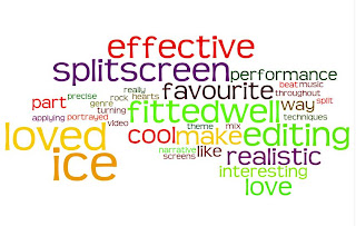
"The make up applying fitted well with the rock genre"
"I loved the ice turning into hearts"
"The 3 way split screen was really effective and cool"
"The editing was interesting"
"I like the way the theme is portrayed throughout the video"
"The performance part was very realistic"
"I like the mix of the narrative and performance"
"My favourite part was the split screens"
"The editing techniques were very precise on the beat of the music"
This is a wordle with some of the words that people used to describe our final video:
1. What did you like about our music video?
2. What is your favourite part of our music video and why?
We watched everyones music video on a big projector and then had time to right down our comments. After the screening our audience were then invited to our "camera corner" where we had a flip camera set up and asked people questions that were specific to our own production. Our questions included:
1. What was your interpretation of our narrative?
2. What did you think our 3 way split screen represented?
3. What was your favourite part of our video?
We got some really positive feedback and everyone who watched it seemed to really enjoy it. Some of the responses we got from the questions on the sheets included comments such as:
"The make up applying fitted well with the rock genre"
"I loved the ice turning into hearts"
"The 3 way split screen was really effective and cool"
"The editing was interesting"
"I like the way the theme is portrayed throughout the video"
"The performance part was very realistic"
"I like the mix of the narrative and performance"
"My favourite part was the split screens"
"The editing techniques were very precise on the beat of the music"
This is a wordle with some of the words that people used to describe our final video:
Saturday, 9 April 2011
Final edit
As a group we all sat down and edited the ending of our video to make it more powerful. We decided that to do this we need to mix it in with flashes of other parts of the video to make it choppy and effective for a big ending. We also added in some of the shots of Charlotte with the lyrics on her earlier on in the video to mix it up and make the video flow a bit more. After a few more tweeks to the video we finally decided it was finished and here is the final version:
Wednesday, 6 April 2011
The ending of our video
All we have left to do now with our video, is complete the ending. We have been finding it very hard to think about what to put in the end of our video as we have been told by people watching the video that it needs to be a powerful and strong ending to wrap up the narrative. We have been asking all of our friends to watch our video and decide on what they think the narrative means to them and how we could end it and we had some very interesting and different responses. Some people have said that they think the narrative is that Charlotte is obsessed with Tom and is always around him and doesn't leave him alone, however other people have said that they think the narrative is that Charlotte and Tom used to be in a relationship that broke down because Tom got too famous and too into his music and Charlotte did not like that. They also had different ideas for the ending and some people said it should just be a purely performance ending with Tom on the stage but others said the ending should be of Charlotte on the stage that the band had been filmed on previously, to show she is always where he is. This feedback in some ways helped us and in other ways confused us because we were not sure how to react to the different opinions but then later realised we had created a Barthes enigma code where the narrative could have many different meanings to people depending on how they viewed it!
This is some audience feedback that we got from some friends about their interpretations of our narrative:
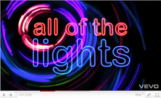
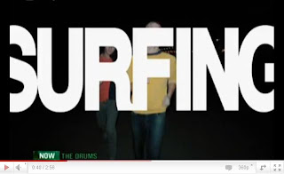
As we were still not sure how to end our video we all sat down as a group and decided to look through some music videos for inspiration. In quite a few videos we found that the lyrics to the song actually appeared in word form in the video for example in "All of the lights" by Kanye West and "Lets go surfing" by the Drums:
We thought that this could possibly work for our music video but if we did it in a more creative way, and then came across the Marina and the Diamonds music video "I am not a robot". In this video, the lead singer is featured with paint all over her and occasionally smudging it over body:
We thought that we could combine the two techniques that we had found and paint the lyrics to the song onto Charlotte and have her smudge it to symbolise the end of their relationship. We could also use editing techniques to speed it up and cut it up to add a strange, powerful feeling to the ending which it what our audience feedback said it needed.
This is what the ending looks like with the initial editing of Charlotte smuding it but we will edit it more when we are next all together:
This is some audience feedback that we got from some friends about their interpretations of our narrative:
As we were still not sure how to end our video we all sat down as a group and decided to look through some music videos for inspiration. In quite a few videos we found that the lyrics to the song actually appeared in word form in the video for example in "All of the lights" by Kanye West and "Lets go surfing" by the Drums:


We thought that this could possibly work for our music video but if we did it in a more creative way, and then came across the Marina and the Diamonds music video "I am not a robot". In this video, the lead singer is featured with paint all over her and occasionally smudging it over body:
We thought that we could combine the two techniques that we had found and paint the lyrics to the song onto Charlotte and have her smudge it to symbolise the end of their relationship. We could also use editing techniques to speed it up and cut it up to add a strange, powerful feeling to the ending which it what our audience feedback said it needed.
This is what the ending looks like with the initial editing of Charlotte smuding it but we will edit it more when we are next all together:
Saturday, 2 April 2011
Draft 6
This is our 6th draft of our video where we have added in a lot more split screens and filled almost our whole video. Some of the split screens we included are performance elements of the band that we have cropped and flipped one side so it looks like they are playing side by side:
Wednesday, 30 March 2011
3 way split screen
We have finally managed to find out how to do a 3 way horizontal split screen on Final Cut Express! After searching through many online forums and YouTube clips we finally found how to do it and after we got started, realised how easy it is to do. We had to use the motion tab on Final Cut and then alter the scale and centre point.
This has allowed us to create our split screen of Charlotte and Tom fighting from 3 different times to emphasise the amount of fights they have and the strain on their past relationship.
After finding out how to do the 3 way split screen this also allowed us to a 2 way horizontal split screen with Charlotte and Tom's feet walking in opposite directions to show either the split of their relationship or that Charlotte will always be there following Tom, depending on your interpretation of the narrative.
Here is our next draft of the video that contains all of the new split screens we have created:
Friday, 25 March 2011
Credits
Last lesson when we had the chance to edit our video, we decided that something that was missing from our video and was crucial to make it look professional was credits at the beginning. We also thought that credits would make our video look better because currently, the beginning of the video is black for quite a long time and is not very interesting but by adding credits in would make this time seem more less pointless.
For our credits we just simply looked at other music videos and copied their style which was:
The band name
The song name
LP
Production company
So we made our credits to this format so they were:
The Mags
She
The Mags LP
LBC Productions
We decided that the most effective way to have these credits were quite simply just in white on the black background in a small simple font.
This is our 4th draft of our music video to Charmer that includes the credits at the beginning:
Tuesday, 22 March 2011
Voyeurism
Something that we thought that was missing from our music video that is common in most successful music videos and is also in the Andrew Goodwin theory is voyeurism. This is where the main character in the song, in this case Tom, looks at them self within the video. This could be done through the use of photos, videos or mirrors. This technique is used in the video "Club Tropicana" by Wham where he is singing into the mirror as he is shaving:
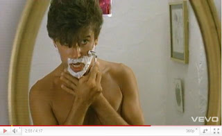
We used a similar technique in our own video by using a mirror to create voyeurism but we also tied in the theme of obsession with it by having Tom looking in the mirror and then the camera panning away and when it pans back Charlotte is also in the mirror looking at him:

We used a similar technique in our own video by using a mirror to create voyeurism but we also tied in the theme of obsession with it by having Tom looking in the mirror and then the camera panning away and when it pans back Charlotte is also in the mirror looking at him:
Monday, 21 March 2011
Split screen
On Friday in our lesson we were editing our video and tried to figure out how to do a 4 way split screen in iMovie. We thought that it could only be done on Final Cut but we still looked on the internet just to see. We ended up finding a video on YouTube that showed us how to do one. We had to use the picture in picture effect on iMovie. We added a plain black screen and then added a clip of Tom on the bass in the corner taking up a quarter of the screen. We then saved that project and added it in a new event. We then added another picture in picture, but this time of Josh on the drums, we then saved that and opened it again in a new one and added Ben on the guitar, finally we saved that one and when we opened it in a new event we added a clip of Josh's foot on the bass drum and that completed our 4 way split screen. I'm really pleased that we managed to find out how to do the split screen on iMovie as this has now made our video start to really come together and look good at the beginning.
This is our third draft that includes the spilt screen opening:
This is our third draft that includes the spilt screen opening:
Thursday, 17 March 2011
Our melting ice hearts
Once we uploaded the footage of the melting ice in heart shapes, we reversed the clips and sped it up to the most it could on iMovie. Unfortunatly the most we could speed it up was only to x400 which was not enough as it still took 7 minutes for the ice to melt at this speed. We decided to move the clips over to Final Cut Express as we thought this might be able to speed up our footage even more. Luckily we found that we could speed it up to 90,000x faster which was just enough to make the ice melt fast enough for what we needed. We then moved the clip back over to iMovie and put it into our video.
This is the melting ice that we reversed on its own:
This is another draft of our video with the ice hearts added in. It also shows the credits that we added at the beginning:
This is the melting ice that we reversed on its own:
This is another draft of our video with the ice hearts added in. It also shows the credits that we added at the beginning:
Tuesday, 15 March 2011
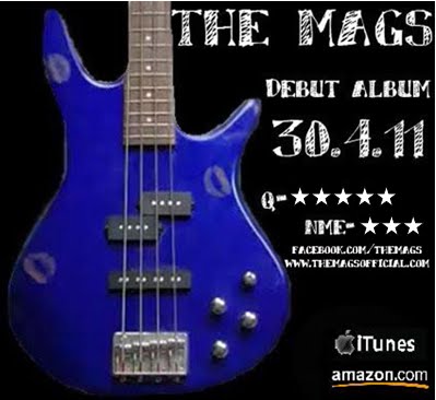
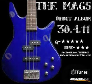
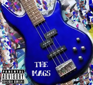
Final magazine advert
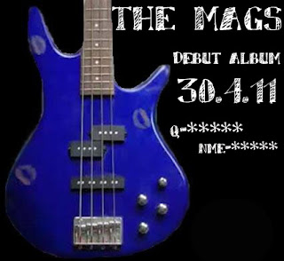
After looking at my advert for another time and comparing it to my research into the codes and conventions of magazine adverts I decided to add the bands website and facebook page to the advert as this was something that I was missing. After gaining some audience feedback from family and friends I also decided to change the stars that I have used to make them solid 5 pointed stars. To do this I moved the advert into Microsoft Word and used the "Shapes" tool to find a star that would look good in my advert. After I added this I was finished and I am now happy with my completed magazine advert promo. I think that I have included all of the necessary elements to make my advert look professional and realistic and will soon get some audience feedback for another opinion.
Monday, 14 March 2011
My magazine advert
After I cut out the guitar from the original background using Photoshop, I put it on Paint and added a black background as black is a colour that is often associated with the rock genre that I found out in my research.
I then used the same font as I used on my digipack to tie it all together to write the information that is common among all magazine adverts. I made sure that I included the name of the band, the release date and some ratings from music magazines. I thought that the best colour writing to use on the black background to make it stand out was white as this also went with the blue guitar and was clear to the audience.
After this I realised that something was missing and after looking back over my research I thought a good thing to add was the logos of places that the album could be purchased. I found the logos for iTunes and Amazon on Google images and copied and pasted them onto my advert.
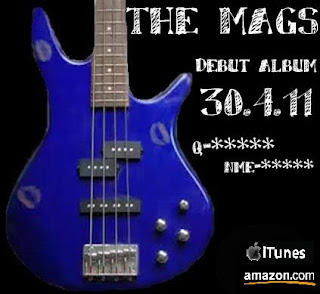

I then used the same font as I used on my digipack to tie it all together to write the information that is common among all magazine adverts. I made sure that I included the name of the band, the release date and some ratings from music magazines. I thought that the best colour writing to use on the black background to make it stand out was white as this also went with the blue guitar and was clear to the audience.

After this I realised that something was missing and after looking back over my research I thought a good thing to add was the logos of places that the album could be purchased. I found the logos for iTunes and Amazon on Google images and copied and pasted them onto my advert.

Saturday, 12 March 2011
My own magazine advert
I have started to design my own magazine advert based on my research into other magazine adverts and my initial ideas and designs.
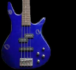
I have decided to include the picture of the guitar with the lipstick kisses on it as this is then a running theme through our music video, my digipack and my magazine advert to tie it all together. This is a technique that many adverts and digipacks use as the audience then associate the band and the song with that one image and they can find it easily in shops.

Unlike my digipack cover I am going to keep the kisses on the guitar so it links more strongly to the music video. I am also going to keep the guitar up right rather than tilting it like I did for my digipack. This way it makes it similar enough to my digipack so there is a recognisable theme but it is not exactly the same.
The programmes that I used for my magazine advert are Photoshop and also Paint. I feel that I have now grown in confidence with this software and can now be more experimental with what I do with it.
I have decided to include the picture of the guitar with the lipstick kisses on it as this is then a running theme through our music video, my digipack and my magazine advert to tie it all together. This is a technique that many adverts and digipacks use as the audience then associate the band and the song with that one image and they can find it easily in shops.
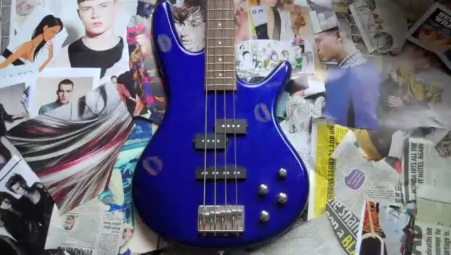
Unlike my digipack cover I am going to keep the kisses on the guitar so it links more strongly to the music video. I am also going to keep the guitar up right rather than tilting it like I did for my digipack. This way it makes it similar enough to my digipack so there is a recognisable theme but it is not exactly the same.
The programmes that I used for my magazine advert are Photoshop and also Paint. I feel that I have now grown in confidence with this software and can now be more experimental with what I do with it.
Wednesday, 9 March 2011
Initial ideas for my magazine advert
After doing some research into other magazine adverts for the release of albums I have started to think about my own ideas for my own advert. I have drawn 4 different ideas for my advert trying to include all of the codes and conventions that are featured in typical album promos. I tried to also link the advert back to my digipack design as this is what most adverts do. These are my 4 rough ideas:


- Posted using BlogPress from my iPhone


- Posted using BlogPress from my iPhone
Friday, 4 March 2011
Ideas for filming
Charlotte has had a new idea for filming that she has prepared and we have all agreed that it is a really good idea that will look really effective in our video. Her idea is having heart shaped ice cubes and filming them melt, we can then speed up the footage and reverse it so that we have a puddle of water moulding into the shape of hearts.
In order for this to work Charlotte made some ice moulds out of heart shaped biscuit cutters and paper mache. Once the paper mache was set to make the bottom of the ice moulds, she filled them with water and put them in her fridge. Once the ice was set she took them out of the moulds and found the sunniest place in her house which happened to be the roof outside her window and set up the flip camera to film them until they melted. We uploaded the footage today onto our macs and were all really impressed with it. We did not have time today to edit the footage but next time we are all in school we can speed it up and reverse it and add it into our music video.
Although hearts are not usually a common convention in the alternative rock genre, I think it fits with our particular video and song because it reflects our theme of obsession and secret love.
N-dubz Morning Star
As I was watching the UK Top 40 on Viva, they played a "future hit" track which was "Morning star" by N-dubz. As I was watching this video I saw that they used some of the editing techniques that we are hoping to include in our own video. They used the different strips that we found in the Blink 182 video for "Always" where it is split in 3 or more ways but showing the same person, so it cuts them up to make it look disorientating to the audience. In this video however, it splits the screen in the oppisite direction so these strips are vertical rather than horizontal. This gives us a different perspective of the idea and we can look at both of the videos and compare them to see which way would look best for our video and fit in with our genre the best. We are hoping to film this next part of our video by next week, but this is another video that we can look at along with the Blink 182 video to get ideas for the editing.
This is the video:
This is the video:
Monday, 28 February 2011
Album promo adverts in magazines
For another part of our coursework we have to make a magazine advert for the release of our album. I have done some research into other album promos from music magazines of our genre. The magazine that I found these adverts in is Q, a monthly music magazine that is usually focussed around rock music.
This first album promotion is 'The Peoples Key' by Bright Eyes. I think that this advert is a typical rock genre album as it uses the colours red, yellow, orange and black which are common rock genre colours that we found from our questionnaire. It is a very simple advert with no photo of the band or of the album itself. It creates the feeling of a fire which may be linked to the actually album content and colour scheme. It has the release date and also a star rating from the magazine which are all typical conventions of an album promo.

The second album advert is 'The Fool' by the band Warpaint. This is a smaller advert in the magazine as it shares it's spread with 2 other adverts as well. This advert is slightly different from the one before as the band is actually shown in the picture and then there is another picture of the actually album which may help the fans find the album in the shops. Once again the colour scheme from the album is used in the advert and the colours are dark, typical rock genre colours of red, black and gold. This also has star ratings from the magazine and also features the bands website and record labels website for extra promotion.

A final advert that I found in the magazine is for the band The Go Team. The reason I like this advert is because the background has some relevance to my digipack with the mosaic type effect. The advert once again used the black and red colour scheme that in associated with the rock genre and it also has ratings from the magazine and the official websites.

Those were the 3 adverts that stood out to me most from this magazine however here is a selection of other album promotions that I also found in the same magazine:


- Posted using BlogPress from my iPhone
Tuesday, 22 February 2011
Codes and conventions of magazine adverts for album releases
Within any music magazine you will find advertisements for new albums being released by bands however big or small. There are certain things that can be found on almost all of these adverts that will be crucial for me to include when making my own magazine advert to make it look realistic and reliable.
These conventions include:
- The artists name and the new album title.
- The release date of the album and the download.
- Website, myspace, facebook or twitter of the artist.
- Product content such as extra DVD footage or any bonus tracks that are included.
- Magazine reviews and star ratings from magazines and newspapers depending on the genre, such as NME, Q, Smash Hits, Kerrang, The Guardian.
- The name of record label.
- Tour dates.
- Photographs or graphics of the artist or things associated with their album.
- Where the album is avaliable to perchase such as HMV or Amazon.
- Lines such as “out now” or “debut album”.
- Any offers that are avaliable such as free downloads.
Wednesday, 16 February 2011
The Brits
Last night the Brit awards were on ITV1 whilst it was being filmed at the O2 arena in London. Loads of performers and artists turned up hoping to win some of the important and well recognised awards. Take That who won the British group award opened the show with their new single and Cee Lo Green who won the award for International solo male artist closed the show with his song "Forget You" who was joined on stage by Paloma Faith who unfortunately did not win the award she was up for which was British Female solo artist. Tinie Temper , Mumford and Sons and Arcade Fire were the main winners on the night. Tinie Temper won the awards for British single and British break through act while Mumford and Sons won the British album of the year and Arcade Fire won International group and International album.

Within the nominees for best international album, was the group that we are using for our music video coursework, Kings of Leon, with their album "Come around Sundown". They were also nominated for best international group but unfortunately lost out on both of the awards to Arcade Fire. It would have been really nice to see Kings of Leon win at least one of their awards, however, Arcade Fire were deserving winners with their album "The Suburbs". The fact that Kings of Leon were nominated for these big awards show that they are well recognised around the world and their music is being appreciated internationally as well as nationally in their own country.

Sunday, 13 February 2011
Editing and voyeurism
In our last lesson we were editing our video and finally worked out how to do a spilt screen on iMovie. We were experimenting with different shots that we could put into a split screen and found that when we put the same shot of Charlotte on the floor lip synching next to eachother and flipped one side, it looked like she was looking at herself singing and this could create voyeurism in our video which it something we need to add. I think that this looked really effective and I will upload it once we get it on YouTube. We still need to also do a 4 way split screen for the opening of our video but we cannot do that on iMovie so will have to wait until we can get onto final cut pro.
We were also discussing that we need to film some more footage for our video so we were deciding when and what to film. We are hoping to all get together after school this Wednesday to film at someones house and we are going to try and film the 3 way split like in the Blink 182 video that I have spoken about before.
- Posted using BlogPress from my iPhone
Friday, 11 February 2011
Reasoning behind my digipack designs
I carefully chose every aspect of my digipack so that I made sure it conformed to the conventions of digipacks from our chosen alternative rock genre. I also made sure that it had a connection to our music video. The reason I chose to do the front and back panels in colour and the insides in black and white is because I thought this was the best way to link it to our music video. In our video we have made our performance shots in black and white and then our narrative of Charlotte, in bright colours. The pictures that are in black and white are of the drums and Tom singing which are both part of the performance in our video and the blue bass that I have put on my front cover, features in the narrative of our video. I have also made sure however that I haven't soley based my digipack on our video because that is not what albums usually do. By having the instruments and microphone on my digipack this makes it broader than just my video as these would be featured in all of the bands songs.
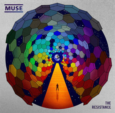
The background that I have used on my front and back cover also convey certain aspects of the rock genre as when I was researching other digipacks I found that some use a mosaic type of design such as the Muse and Killers album covers which could be linked to my choice of jumbled up background.
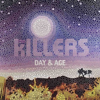

The background that I have used on my front and back cover also convey certain aspects of the rock genre as when I was researching other digipacks I found that some use a mosaic type of design such as the Muse and Killers album covers which could be linked to my choice of jumbled up background.

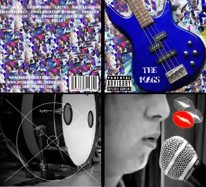
Final digipack
This is my final digipack design all put together:

and these are the individual panels so you can see them more clearly:
Front

Middle

Middle (holding CD)

Back

and these are the individual panels so you can see them more clearly:
Front

Middle

Middle (holding CD)

Back

The inside panels to my digipack
Next I had to design and make the 2 inside panels to go with my digipack. I decided that these panels should be black and white so that they conform to the rock genre. I also found in my research that a lot of rock digipacks use black and white and one dominant colour, for example red, so I tried this out on my inside panels.
Once again I used Photoshop for this part of my digipack but I also used Paint for some parts. I found some print screens from our video that I thought would look effective in my digipack and decided on these:
I like these photos because I think they represent the rock genre because there is always a lot of performance associated with the genre and also I have chosen a shot of Tom where only a small part of his face is shown as it not very common for the artist to be shown on their album cover in the rock genre which is very different compared to other genres such as Pop where the artist is usually the main focus of the album cover.
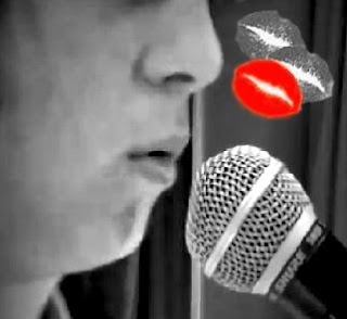
To try and use what I found in my research with the black and white being used with one dominant colour I decided to use a lipstick kiss mark as this is something that is featured in our video. This is not something that would usually be associated with the rock genre but I decided to use it as it represents our video. I found a lipstick kiss on Google, made it smaller on paint, copied it into photoshop, used the Lassoo tool to cut it away from the background and rotate it slightly and then pasted it 3 times onto the photo of Tom. I then changed the kisses the black and white apart from one which remained red. I like how this has turned out and think it looks like a realistic representation of a rock digipack inside:
For the other inside panel, I didn't do much to the photograph as I already liked what it looked like but as this is going to be the part that holds the actual CD I represented this by drawing the outline of the CD onto it using Paint:
Once again I used Photoshop for this part of my digipack but I also used Paint for some parts. I found some print screens from our video that I thought would look effective in my digipack and decided on these:


I like these photos because I think they represent the rock genre because there is always a lot of performance associated with the genre and also I have chosen a shot of Tom where only a small part of his face is shown as it not very common for the artist to be shown on their album cover in the rock genre which is very different compared to other genres such as Pop where the artist is usually the main focus of the album cover.
To try and use what I found in my research with the black and white being used with one dominant colour I decided to use a lipstick kiss mark as this is something that is featured in our video. This is not something that would usually be associated with the rock genre but I decided to use it as it represents our video. I found a lipstick kiss on Google, made it smaller on paint, copied it into photoshop, used the Lassoo tool to cut it away from the background and rotate it slightly and then pasted it 3 times onto the photo of Tom. I then changed the kisses the black and white apart from one which remained red. I like how this has turned out and think it looks like a realistic representation of a rock digipack inside:

For the other inside panel, I didn't do much to the photograph as I already liked what it looked like but as this is going to be the part that holds the actual CD I represented this by drawing the outline of the CD onto it using Paint:

The back cover of my digipack
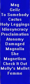
The more I looked at the back cover that I originally made the more I did not like it. I thought it may just be because of the font, but even after I changed it to the new font I still did not like it. I decided that maybe it was because of the blue strip down the middle which although fits with the bass on the front, makes the cover look a bit unprofessional and not very nice. On Photoshop I started to play about with the background again and used the "smudge" and "blur" tool to play around with the colours and found that if I blurred the background, you could see the white font clearer, meaning that I could take away the blue box. I also changed where the track list is and rather than having it vertical down the middle of the cover I moved it to going horozontally across the top which made it more interesting and there is also a Kings of Leon album that does this, showing the conventions of a rock genre album.
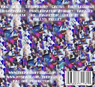
I also added a barcode to the bottom right hand corner that I found on Google images as this makes my digipack look more professional and realistic. I then added some more smudges to my background and some more text that says:
"www.themagsofficial.com"
"www.myspace.com/themags"
"Mac One Productions"
These bits of texts also make my digipack look more realistic as many artists have their own offical websites and myspaces which it where a lot of artists start off their career. I used Mac One Productions because this is also the production name that our group used last year for our film opening.
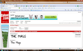
Font used on my digipack
I originally used the font "Small Font" that I found on Photoshop for the font on my digipack for the tracklist and album name on the front:
At first I thought that it may conform to the rock genre and look good on my digipack but the more I was looking at it I found that it made my digipack look very home made so not very professional. I decided to look on a website "www.dafont.com" and download a better font to use that would look better on my digipack and conform more to the rock genre.
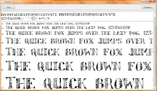
From my research I have found that the writing on rock digipacks are fairly simple and easy to read. These are some of the ones that I found that I liked:
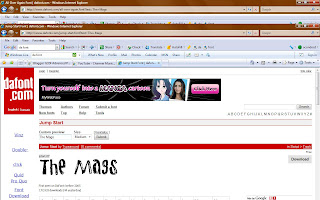
But then I finally came across the font called "Sketchy" which I really liked and thought it would be perfect for my digipack for the album name on the front cover and track list on the back:
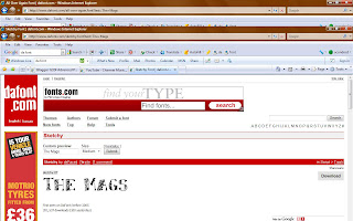
I decided that this was my favourite font out of all the ones I had seen and so changed the writing on my front cover to see if it looked good with my digipack and really liked it:

At first I thought that it may conform to the rock genre and look good on my digipack but the more I was looking at it I found that it made my digipack look very home made so not very professional. I decided to look on a website "www.dafont.com" and download a better font to use that would look better on my digipack and conform more to the rock genre.
From my research I have found that the writing on rock digipacks are fairly simple and easy to read. These are some of the ones that I found that I liked:


But then I finally came across the font called "Sketchy" which I really liked and thought it would be perfect for my digipack for the album name on the front cover and track list on the back:


I decided that this was my favourite font out of all the ones I had seen and so changed the writing on my front cover to see if it looked good with my digipack and really liked it:

Subscribe to:
Comments (Atom)