- Posted using BlogPress from my iPhone
The Mags - She
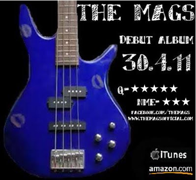
Final magazine advert
Showing posts with label Iphone blogging. Show all posts
Wednesday, 9 March 2011
Initial ideas for my magazine advert
After doing some research into other magazine adverts for the release of albums I have started to think about my own ideas for my own advert. I have drawn 4 different ideas for my advert trying to include all of the codes and conventions that are featured in typical album promos. I tried to also link the advert back to my digipack design as this is what most adverts do. These are my 4 rough ideas:


- Posted using BlogPress from my iPhone
Monday, 28 February 2011
Album promo adverts in magazines
For another part of our coursework we have to make a magazine advert for the release of our album. I have done some research into other album promos from music magazines of our genre. The magazine that I found these adverts in is Q, a monthly music magazine that is usually focussed around rock music.
This first album promotion is 'The Peoples Key' by Bright Eyes. I think that this advert is a typical rock genre album as it uses the colours red, yellow, orange and black which are common rock genre colours that we found from our questionnaire. It is a very simple advert with no photo of the band or of the album itself. It creates the feeling of a fire which may be linked to the actually album content and colour scheme. It has the release date and also a star rating from the magazine which are all typical conventions of an album promo.

The second album advert is 'The Fool' by the band Warpaint. This is a smaller advert in the magazine as it shares it's spread with 2 other adverts as well. This advert is slightly different from the one before as the band is actually shown in the picture and then there is another picture of the actually album which may help the fans find the album in the shops. Once again the colour scheme from the album is used in the advert and the colours are dark, typical rock genre colours of red, black and gold. This also has star ratings from the magazine and also features the bands website and record labels website for extra promotion.

A final advert that I found in the magazine is for the band The Go Team. The reason I like this advert is because the background has some relevance to my digipack with the mosaic type effect. The advert once again used the black and red colour scheme that in associated with the rock genre and it also has ratings from the magazine and the official websites.

Those were the 3 adverts that stood out to me most from this magazine however here is a selection of other album promotions that I also found in the same magazine:


- Posted using BlogPress from my iPhone
This first album promotion is 'The Peoples Key' by Bright Eyes. I think that this advert is a typical rock genre album as it uses the colours red, yellow, orange and black which are common rock genre colours that we found from our questionnaire. It is a very simple advert with no photo of the band or of the album itself. It creates the feeling of a fire which may be linked to the actually album content and colour scheme. It has the release date and also a star rating from the magazine which are all typical conventions of an album promo.
The second album advert is 'The Fool' by the band Warpaint. This is a smaller advert in the magazine as it shares it's spread with 2 other adverts as well. This advert is slightly different from the one before as the band is actually shown in the picture and then there is another picture of the actually album which may help the fans find the album in the shops. Once again the colour scheme from the album is used in the advert and the colours are dark, typical rock genre colours of red, black and gold. This also has star ratings from the magazine and also features the bands website and record labels website for extra promotion.
A final advert that I found in the magazine is for the band The Go Team. The reason I like this advert is because the background has some relevance to my digipack with the mosaic type effect. The advert once again used the black and red colour scheme that in associated with the rock genre and it also has ratings from the magazine and the official websites.
Those were the 3 adverts that stood out to me most from this magazine however here is a selection of other album promotions that I also found in the same magazine:
- Posted using BlogPress from my iPhone
Sunday, 13 February 2011
Editing and voyeurism
In our last lesson we were editing our video and finally worked out how to do a spilt screen on iMovie. We were experimenting with different shots that we could put into a split screen and found that when we put the same shot of Charlotte on the floor lip synching next to eachother and flipped one side, it looked like she was looking at herself singing and this could create voyeurism in our video which it something we need to add. I think that this looked really effective and I will upload it once we get it on YouTube. We still need to also do a 4 way split screen for the opening of our video but we cannot do that on iMovie so will have to wait until we can get onto final cut pro.
We were also discussing that we need to film some more footage for our video so we were deciding when and what to film. We are hoping to all get together after school this Wednesday to film at someones house and we are going to try and film the 3 way split like in the Blink 182 video that I have spoken about before.
- Posted using BlogPress from my iPhone
We were also discussing that we need to film some more footage for our video so we were deciding when and what to film. We are hoping to all get together after school this Wednesday to film at someones house and we are going to try and film the 3 way split like in the Blink 182 video that I have spoken about before.
- Posted using BlogPress from my iPhone
Friday, 4 February 2011
Initial ideas for my digipack and iPhone blogging
I have just found an app on my iPhone called BlogPress that means I will be able to blog things straight from my phone and will also make it easier to upload photos without having to put them on the computer!
I have drawn out some initial ideas for my own digipack so that I can see what it looks like visually. I chose to put the blue bass from our stop motion on the front as I really like the colours and also think that a bass guitar is an important symbol of the rock genre. I also designed the back cover and one of the inside panels which will hold the cd. I thought that by having the drum on that inside panel will look effective because it will be the same shape as the cd. I now just need to design the other inside panel and then start putting it together properly. These are the pictures of my initial drawings:


- Posted using BlogPress from my iPhone
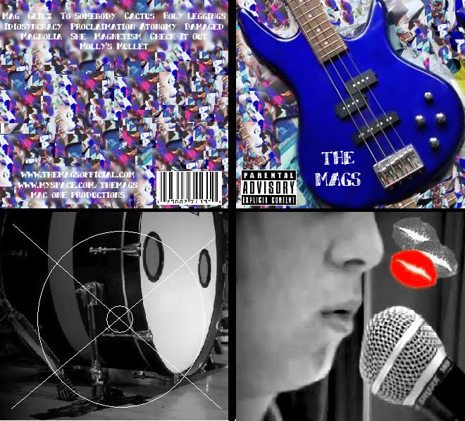
I have drawn out some initial ideas for my own digipack so that I can see what it looks like visually. I chose to put the blue bass from our stop motion on the front as I really like the colours and also think that a bass guitar is an important symbol of the rock genre. I also designed the back cover and one of the inside panels which will hold the cd. I thought that by having the drum on that inside panel will look effective because it will be the same shape as the cd. I now just need to design the other inside panel and then start putting it together properly. These are the pictures of my initial drawings:
- Posted using BlogPress from my iPhone
Subscribe to:
Posts (Atom)