The more I looked at the back cover that I originally made the more I did not like it. I thought it may just be because of the font, but even after I changed it to the new font I still did not like it. I decided that maybe it was because of the blue strip down the middle which although fits with the bass on the front, makes the cover look a bit unprofessional and not very nice. On Photoshop I started to play about with the background again and used the "smudge" and "blur" tool to play around with the colours and found that if I blurred the background, you could see the white font clearer, meaning that I could take away the blue box. I also changed where the track list is and rather than having it vertical down the middle of the cover I moved it to going horozontally across the top which made it more interesting and there is also a Kings of Leon album that does this, showing the conventions of a rock genre album.
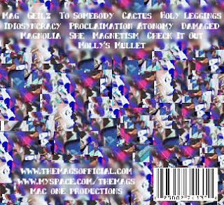
I also added a barcode to the bottom right hand corner that I found on Google images as this makes my digipack look more professional and realistic. I then added some more smudges to my background and some more text that says:
"www.themagsofficial.com"
"www.myspace.com/themags"
"Mac One Productions"
These bits of texts also make my digipack look more realistic as many artists have their own offical websites and myspaces which it where a lot of artists start off their career. I used Mac One Productions because this is also the production name that our group used last year for our film opening.

No comments:
Post a Comment
Note: only a member of this blog may post a comment.