Once again I used Photoshop for this part of my digipack but I also used Paint for some parts. I found some print screens from our video that I thought would look effective in my digipack and decided on these:
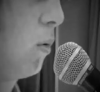
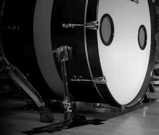
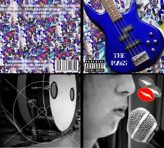
I like these photos because I think they represent the rock genre because there is always a lot of performance associated with the genre and also I have chosen a shot of Tom where only a small part of his face is shown as it not very common for the artist to be shown on their album cover in the rock genre which is very different compared to other genres such as Pop where the artist is usually the main focus of the album cover.
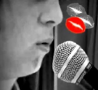
To try and use what I found in my research with the black and white being used with one dominant colour I decided to use a lipstick kiss mark as this is something that is featured in our video. This is not something that would usually be associated with the rock genre but I decided to use it as it represents our video. I found a lipstick kiss on Google, made it smaller on paint, copied it into photoshop, used the Lassoo tool to cut it away from the background and rotate it slightly and then pasted it 3 times onto the photo of Tom. I then changed the kisses the black and white apart from one which remained red. I like how this has turned out and think it looks like a realistic representation of a rock digipack inside:
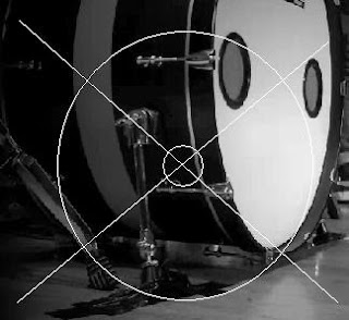
For the other inside panel, I didn't do much to the photograph as I already liked what it looked like but as this is going to be the part that holds the actual CD I represented this by drawing the outline of the CD onto it using Paint:

No comments:
Post a Comment
Note: only a member of this blog may post a comment.