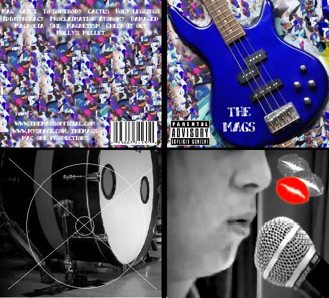
I have also started to work on my back cover for my digipack and added the track list to it. The back of my digipack is very similar to the background of my front cover, but I blurred and smudged the images together to make it look more disorientated which could relate to our music video. I had to also add a block of blue down the middle of the cover to allow the writing of the track list to be seen. To keep the theme consist ant through my digipack, I made the strip the same colour blue as the bass on the front to tie it all together:

I still need to add some more features to my back cover however, such as a bar code and copyright symbols to make it more realistic and true to other digipacks.


No comments:
Post a Comment
Note: only a member of this blog may post a comment.