
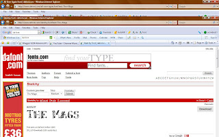
At first I thought that it may conform to the rock genre and look good on my digipack but the more I was looking at it I found that it made my digipack look very home made so not very professional. I decided to look on a website "www.dafont.com" and download a better font to use that would look better on my digipack and conform more to the rock genre.
From my research I have found that the writing on rock digipacks are fairly simple and easy to read. These are some of the ones that I found that I liked:
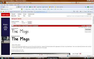
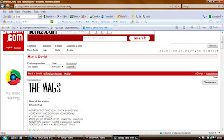
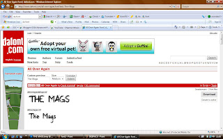
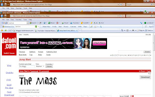
But then I finally came across the font called "Sketchy" which I really liked and thought it would be perfect for my digipack for the album name on the front cover and track list on the back:
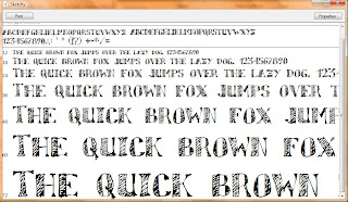
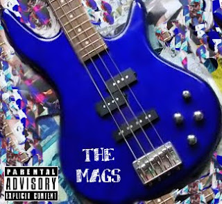
I decided that this was my favourite font out of all the ones I had seen and so changed the writing on my front cover to see if it looked good with my digipack and really liked it:


No comments:
Post a Comment
Note: only a member of this blog may post a comment.