We have finally managed to find out how to do a 3 way horizontal split screen on Final Cut Express! After searching through many online forums and YouTube clips we finally found how to do it and after we got started, realised how easy it is to do. We had to use the motion tab on Final Cut and then alter the scale and centre point.
This has allowed us to create our split screen of Charlotte and Tom fighting from 3 different times to emphasise the amount of fights they have and the strain on their past relationship.
After finding out how to do the 3 way split screen this also allowed us to a 2 way horizontal split screen with Charlotte and Tom's feet walking in opposite directions to show either the split of their relationship or that Charlotte will always be there following Tom, depending on your interpretation of the narrative.
Here is our next draft of the video that contains all of the new split screens we have created:
The Mags - She
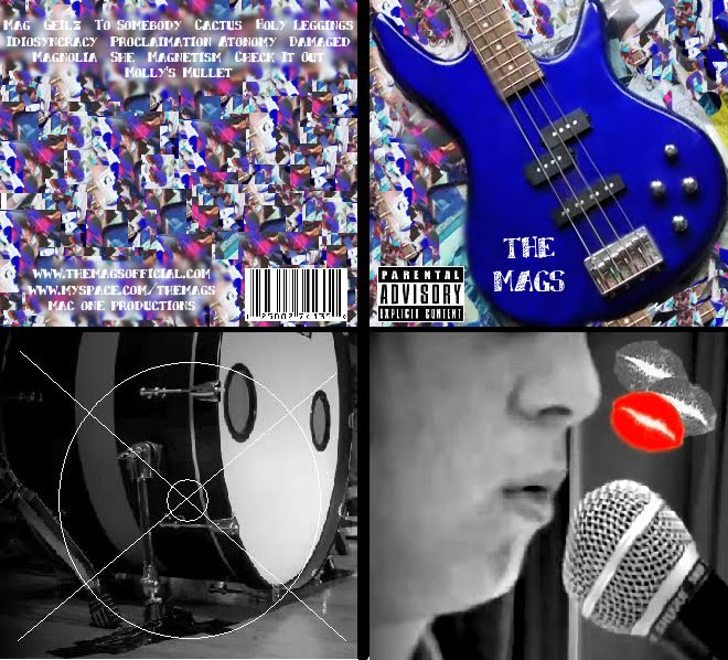
Final magazine advert
Wednesday, 30 March 2011
Friday, 25 March 2011
Credits
Last lesson when we had the chance to edit our video, we decided that something that was missing from our video and was crucial to make it look professional was credits at the beginning. We also thought that credits would make our video look better because currently, the beginning of the video is black for quite a long time and is not very interesting but by adding credits in would make this time seem more less pointless.
For our credits we just simply looked at other music videos and copied their style which was:
The band name
The song name
LP
Production company
So we made our credits to this format so they were:
The Mags
She
The Mags LP
LBC Productions
We decided that the most effective way to have these credits were quite simply just in white on the black background in a small simple font.
This is our 4th draft of our music video to Charmer that includes the credits at the beginning:
Tuesday, 22 March 2011
Voyeurism
Something that we thought that was missing from our music video that is common in most successful music videos and is also in the Andrew Goodwin theory is voyeurism. This is where the main character in the song, in this case Tom, looks at them self within the video. This could be done through the use of photos, videos or mirrors. This technique is used in the video "Club Tropicana" by Wham where he is singing into the mirror as he is shaving:
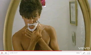
We used a similar technique in our own video by using a mirror to create voyeurism but we also tied in the theme of obsession with it by having Tom looking in the mirror and then the camera panning away and when it pans back Charlotte is also in the mirror looking at him:

We used a similar technique in our own video by using a mirror to create voyeurism but we also tied in the theme of obsession with it by having Tom looking in the mirror and then the camera panning away and when it pans back Charlotte is also in the mirror looking at him:
Monday, 21 March 2011
Split screen
On Friday in our lesson we were editing our video and tried to figure out how to do a 4 way split screen in iMovie. We thought that it could only be done on Final Cut but we still looked on the internet just to see. We ended up finding a video on YouTube that showed us how to do one. We had to use the picture in picture effect on iMovie. We added a plain black screen and then added a clip of Tom on the bass in the corner taking up a quarter of the screen. We then saved that project and added it in a new event. We then added another picture in picture, but this time of Josh on the drums, we then saved that and opened it again in a new one and added Ben on the guitar, finally we saved that one and when we opened it in a new event we added a clip of Josh's foot on the bass drum and that completed our 4 way split screen. I'm really pleased that we managed to find out how to do the split screen on iMovie as this has now made our video start to really come together and look good at the beginning.
This is our third draft that includes the spilt screen opening:
This is our third draft that includes the spilt screen opening:
Thursday, 17 March 2011
Our melting ice hearts
Once we uploaded the footage of the melting ice in heart shapes, we reversed the clips and sped it up to the most it could on iMovie. Unfortunatly the most we could speed it up was only to x400 which was not enough as it still took 7 minutes for the ice to melt at this speed. We decided to move the clips over to Final Cut Express as we thought this might be able to speed up our footage even more. Luckily we found that we could speed it up to 90,000x faster which was just enough to make the ice melt fast enough for what we needed. We then moved the clip back over to iMovie and put it into our video.
This is the melting ice that we reversed on its own:
This is another draft of our video with the ice hearts added in. It also shows the credits that we added at the beginning:
This is the melting ice that we reversed on its own:
This is another draft of our video with the ice hearts added in. It also shows the credits that we added at the beginning:
Tuesday, 15 March 2011
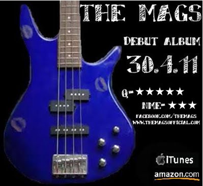
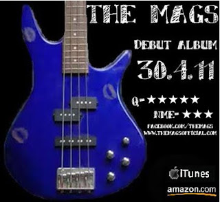
Final magazine advert
After looking at my advert for another time and comparing it to my research into the codes and conventions of magazine adverts I decided to add the bands website and facebook page to the advert as this was something that I was missing. After gaining some audience feedback from family and friends I also decided to change the stars that I have used to make them solid 5 pointed stars. To do this I moved the advert into Microsoft Word and used the "Shapes" tool to find a star that would look good in my advert. After I added this I was finished and I am now happy with my completed magazine advert promo. I think that I have included all of the necessary elements to make my advert look professional and realistic and will soon get some audience feedback for another opinion.

Monday, 14 March 2011
My magazine advert
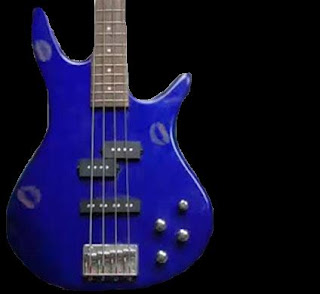
After I cut out the guitar from the original background using Photoshop, I put it on Paint and added a black background as black is a colour that is often associated with the rock genre that I found out in my research.
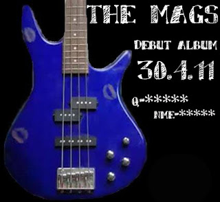
I then used the same font as I used on my digipack to tie it all together to write the information that is common among all magazine adverts. I made sure that I included the name of the band, the release date and some ratings from music magazines. I thought that the best colour writing to use on the black background to make it stand out was white as this also went with the blue guitar and was clear to the audience.
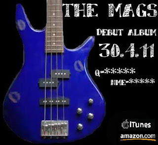
After this I realised that something was missing and after looking back over my research I thought a good thing to add was the logos of places that the album could be purchased. I found the logos for iTunes and Amazon on Google images and copied and pasted them onto my advert.

I then used the same font as I used on my digipack to tie it all together to write the information that is common among all magazine adverts. I made sure that I included the name of the band, the release date and some ratings from music magazines. I thought that the best colour writing to use on the black background to make it stand out was white as this also went with the blue guitar and was clear to the audience.

After this I realised that something was missing and after looking back over my research I thought a good thing to add was the logos of places that the album could be purchased. I found the logos for iTunes and Amazon on Google images and copied and pasted them onto my advert.

Saturday, 12 March 2011
My own magazine advert
I have started to design my own magazine advert based on my research into other magazine adverts and my initial ideas and designs.
I have decided to include the picture of the guitar with the lipstick kisses on it as this is then a running theme through our music video, my digipack and my magazine advert to tie it all together. This is a technique that many adverts and digipacks use as the audience then associate the band and the song with that one image and they can find it easily in shops.
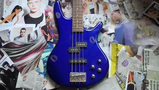
Unlike my digipack cover I am going to keep the kisses on the guitar so it links more strongly to the music video. I am also going to keep the guitar up right rather than tilting it like I did for my digipack. This way it makes it similar enough to my digipack so there is a recognisable theme but it is not exactly the same.
The programmes that I used for my magazine advert are Photoshop and also Paint. I feel that I have now grown in confidence with this software and can now be more experimental with what I do with it.
I have decided to include the picture of the guitar with the lipstick kisses on it as this is then a running theme through our music video, my digipack and my magazine advert to tie it all together. This is a technique that many adverts and digipacks use as the audience then associate the band and the song with that one image and they can find it easily in shops.

Unlike my digipack cover I am going to keep the kisses on the guitar so it links more strongly to the music video. I am also going to keep the guitar up right rather than tilting it like I did for my digipack. This way it makes it similar enough to my digipack so there is a recognisable theme but it is not exactly the same.
The programmes that I used for my magazine advert are Photoshop and also Paint. I feel that I have now grown in confidence with this software and can now be more experimental with what I do with it.
Wednesday, 9 March 2011
Initial ideas for my magazine advert
After doing some research into other magazine adverts for the release of albums I have started to think about my own ideas for my own advert. I have drawn 4 different ideas for my advert trying to include all of the codes and conventions that are featured in typical album promos. I tried to also link the advert back to my digipack design as this is what most adverts do. These are my 4 rough ideas:


- Posted using BlogPress from my iPhone


- Posted using BlogPress from my iPhone
Friday, 4 March 2011
Ideas for filming
Charlotte has had a new idea for filming that she has prepared and we have all agreed that it is a really good idea that will look really effective in our video. Her idea is having heart shaped ice cubes and filming them melt, we can then speed up the footage and reverse it so that we have a puddle of water moulding into the shape of hearts.
In order for this to work Charlotte made some ice moulds out of heart shaped biscuit cutters and paper mache. Once the paper mache was set to make the bottom of the ice moulds, she filled them with water and put them in her fridge. Once the ice was set she took them out of the moulds and found the sunniest place in her house which happened to be the roof outside her window and set up the flip camera to film them until they melted. We uploaded the footage today onto our macs and were all really impressed with it. We did not have time today to edit the footage but next time we are all in school we can speed it up and reverse it and add it into our music video.
Although hearts are not usually a common convention in the alternative rock genre, I think it fits with our particular video and song because it reflects our theme of obsession and secret love.
N-dubz Morning Star
As I was watching the UK Top 40 on Viva, they played a "future hit" track which was "Morning star" by N-dubz. As I was watching this video I saw that they used some of the editing techniques that we are hoping to include in our own video. They used the different strips that we found in the Blink 182 video for "Always" where it is split in 3 or more ways but showing the same person, so it cuts them up to make it look disorientating to the audience. In this video however, it splits the screen in the oppisite direction so these strips are vertical rather than horizontal. This gives us a different perspective of the idea and we can look at both of the videos and compare them to see which way would look best for our video and fit in with our genre the best. We are hoping to film this next part of our video by next week, but this is another video that we can look at along with the Blink 182 video to get ideas for the editing.
This is the video:
This is the video:
Subscribe to:
Posts (Atom)