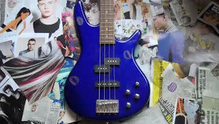
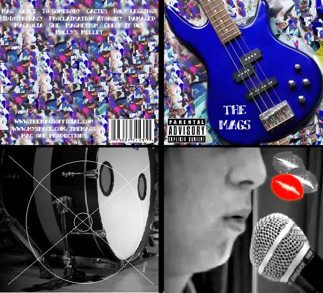
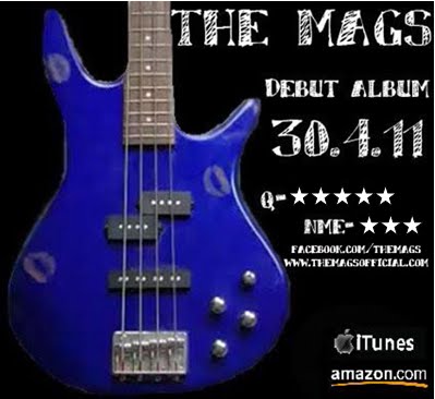
I have decided to include the picture of the guitar with the lipstick kisses on it as this is then a running theme through our music video, my digipack and my magazine advert to tie it all together. This is a technique that many adverts and digipacks use as the audience then associate the band and the song with that one image and they can find it easily in shops.

Unlike my digipack cover I am going to keep the kisses on the guitar so it links more strongly to the music video. I am also going to keep the guitar up right rather than tilting it like I did for my digipack. This way it makes it similar enough to my digipack so there is a recognisable theme but it is not exactly the same.
The programmes that I used for my magazine advert are Photoshop and also Paint. I feel that I have now grown in confidence with this software and can now be more experimental with what I do with it.


No comments:
Post a Comment
Note: only a member of this blog may post a comment.